1
2
3
4
5
6
7
8
9
10
11
12
13
14
15
16
17
18
19


MARGATE
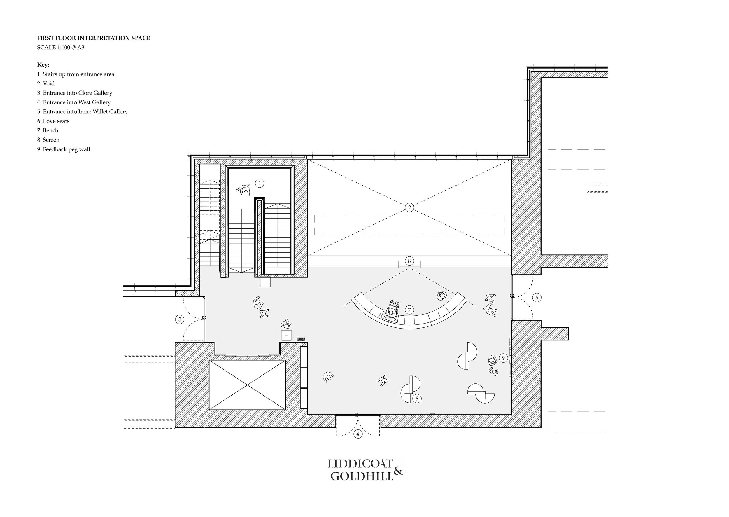
This year Liddicoat & Goldhill were commissioned by Turner Contemporary to design the interpretation area of Turner Prize 2019. This is the first floor balcony area of Turner Contemporary, an atrium and entrance vestibule to the 4 galleries exhibiting the 4 Turner Prize 2019 nominees: Oscar Murillo; Helen Cammock; Lawrence Abu Hamdan; and Tai Shani.
The interpretation area in an art gallery is a liminal space, subject to many requirements; it must provide orientation, information and welcome – as well as serving as a gathering place, and a space for contemplation – it is a buffer-zone between the outside world and the exhibition. For this project specifically, the interpretation area is the point of arrival for visitors to Turner Prize 2019 in the main galleries of Turner Contemporary. It is the central point for all 4 exhibitions, insulating them from each other, as well as forging links and creating a cohesive whole.
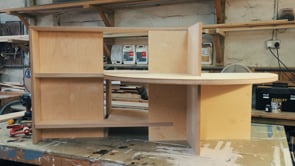
To meet this complex brief our studio designed curved inter-sectioning pieces of furniture, subtly delineating areas, re-imagining the open-plan space and altering the way it is traversed. To allow video-watching we made a semi-circle of bench provision, facing the balcony wall, with spaces built in for those on wheels, armrests for those who need a hand, and a high back to create a space of calm attention to the artists, and maximise the experience of sky. It’s shell-like arch acts as a sound mirror for the audio, and a psychological micro-chapel. Books are displayed along the outside of the curve – a convex reading room – the structural ribs (an echo of boat-building) forming the shelves.
In addition to this piece, three love-seats, like constructivist sculptures rather than the overstuffed velvet types of an historical gallery, are positioned around the room – each with a singular perch for lone repose and a double for those with a child or extra baggage – a small shelf is provided for writing a note or drawing a picture.
We took cues from the fresh, clean, simple design employed for Turner Prize 2019 – the positioning of the video screen with the seaview behind, a direct reference to the poster. We sought to reflect the atmosphere of deep thought and creativity that is core to the work of each artist included. We incorporated way-finding not just as a graphic adjunct to the design – but as integral to the purpose of the space. The interpretation area offers not a singular narrative – but options – each artists name appears on their own door, but the order in which one visits is left to the individual.
Photos by Jo Willis